Skyhooks, The Easter Bunny…
…and Media Airport Fare Comparisons
These have one thing in common: they have nothing to do with reality.
BTS Data Is Out For The 2nd Q of 2018. One of the downsides of having raw federal data published is that too often folks in the Fourth Estate, completely without adult supervision, get their paws on it and then publish articles that once again prove that lack of knowledge of the subject matter is not a barrier to filling several column inches with intellectual sludge.
Data In The Hands of Amateurs. One of the most egregious is the dimbulb “fare comparisons” between airports that inevitably come out within hours of the BTS filing. It’s sort of like the recent headline that trumpeted something to the effect that “American has hubs in the top four connected US airports.” When the babble descends to that level, the media source is beyond help.
This is not to imply that there aren’t some really savvy and professional folks in the media covering air travel. The majority of network correspondents we talk to have an incredible grasp of the industry.
But every quarter when the DOT/BTS stats come out, there is a blizzard of articles from the lightweight Peanut Gallery that are amazingly devoid of any understanding of the subject matter whatsoever.
Air Travel Is A Set of Cost Factors At Each Airport. Here’s the bottom line: air transportation is not a single commodity, like a Big Mac or a gallon of unleaded, that can be compared from one city to another.
It’s a system where costs are the result of a range of factors specific to the destination. Things like the travel mix, the geographic location of the city, the destinational distribution – even the levels of ancillary fares at some carriers, which affect what’s reported as “fare revenue.”
Another problem is that the raw BTS data is based on per-passenger ticket-spend… which means that the mix of one-ways, round trips, and multi-leg itineraries are all tossed in together. These are factors that will vary by geographic location and are not consistent. The travel mix at Newark is very different than that at Charlotte, or at Shreveport.
We’ve compiled a comparison of the top 100 domestic O&D airports in the second quarter of 2018. It ranks airports by cost per mike, average length of haul, raw fares paid.
The top ten by passenger O&D are shown here.
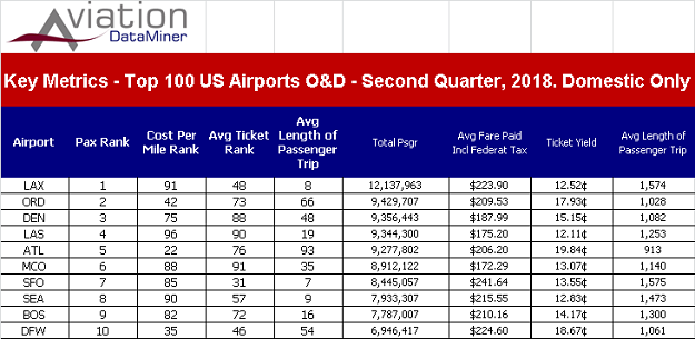
However, the complete 100 O&D is available in an Excel spreadsheet, by clicking here and just requesting a copy.
In the meantime, take a gander at the rankings in the four key categories… particularly the average length of passenger haul. It varies by location and the economic and consumer factors at each.
Again, these data are not for folks that don’t have strong understanding of the airline industry. What’s reported by carriers as “ticket revenue” today is more like a down-payment, before ancillary charges. And those make ULCC-dominated airports – like SFB and PGV – a pool of intellectual quicksand for reporters who don’t understand the industry.
Subscribers to Aviation DataMiner™ and the Airport Quarterly & Short Term Forecasts, have this data in several report formats.
In airport planning – whether it’s facility projections, air access development, or making logical decisions on airline strategies – better data mean better planning for the future.
For more information on Aviation DataMiner™ – including the new and exclusive Airports:USA® forecast suite – click here.