Fourth Quarter 2017 Fare & Enplanement Data…
Let The Media Circus Begin
The DOT has finally issued O&D traffic data for the last quarter of 2017.
Subscribers to Aviation DataMiner™ now have full access, and subscribers to the Quarterly Airport Performance Summaries will be receiving their copies in the next few days.
Just Because It’s From The Gov’ment Doesn’t Mean It’s Accurate. BGI’s Aviation DataMiner™ system has scanned and filtered the numbers to cull out the typical reporting errors, and we’ve reconciled the raw data against other sources, including airport-reported information.
The 10% sampling system still used by the DOT delivers a lot of misleading data – particularly at smaller airports and in less-dense O&D markets.
Just in passing – a GAO report noted that the 10% sample was originally necessary due to the fact that in ancient times – the 1960s & 1970s – computer power was a fraction of what was currently available. They recommended that the DOT go to a 100% audit of airline itineraries.
That report is now old enough to vote – it was issued in 1997. And here we still are. It’s the reason the Boyd Group International’s Aviation DataMiner™ is more accurate than any other source. We recognize that a 10% sample can send a lot planning into the weeds.
Now, let’s take a look at the 4Q of 2017…
First, regardless of the panting “reports” declaring airport had the “highest fares” or had the biggest spike or decline, here’s some rain on the media parade….
There is no accurate way of comparing fares between airports.
Write that down… comparing fare levels – by almost any metric – between airports or between markets, is just plain inaccurate and, in many cases, indicative of amateur-act analyses.
Fares: The Drivers Are Different From Airport To Airport. In fact, the fares at each airport are the result of .factors that vary materially, based on the economic base, the geographic location of the airport, the levels of service, population, and other issues. The metrics are not consistent.
This is because the factors that contribute to what passengers pay vary materially from airport to airport.
For the 4Q 2017, we took airports with over 1 million quarterly enplanements, and ranked the top 15 by local O&D domestic passengers…
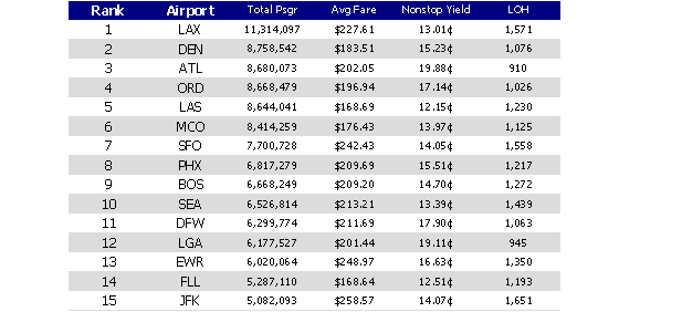
The fare trap that a lot of reporters, amateur consultants and analysts fall into is demonstrated very easily by comparing #1 LAX to #2 Denver.
Denver, to the uninformed, has much lower fares than does LAX. But take a look at what passengers are paying on a per mile basis… Denver has an average yield that’s nearly 18% higher than LAX. Reason? Take a gander at the length of haul. The consumer travel patterns represent a length of passenger trip at LAX that’s about 30% more than at Denver.
Therefore, comparisons of these fares are useless… because the travel mix is completely different.
Passenger Travel Mix Is Not Comparable. Below we look at 15 airports that had the “highest fares” in the 4Q of 2017…
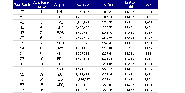
Take a look… the average fare (here expressed as one-way, federal fees and taxes included) is clearly driven by the average length of passenger trip (LOH)… i.e., the geographic location is a factor that is not equal or comparable by airport.
Okay, how about what consumers are paying for air travel on a per-mile basis… we took the same airports (those over 1M quarterly passengers) and compared the cost per mile of the top 15…

The cost per mile is high in most of these markets because the nature of the traffic tends to be shorter haul… and, note too, that these markets are served also by Southwest, which according to media lore, always drives fares down.
They can, but even at STL, which is again now classified by Airports:USA® as a (Southwest) connecting hub, is the airport with the fifth highest per-mile fares.
Reason: the make up of the traffic results in relatively short consumer trips… hence, higher per-mile fares.
BTS “Fare” Data Reports – Approach With Caution. A lot of media stories will come out, spouting the BTS “fare rankings.” Actually these are “air travel spend” ratings. They take the total passenger itineraries, and divide the total spend – including one-ways, multi-leg journeys, and round trip – and produce an “average.”
But just as consumer air travel patterns vary from airport to airport, so, too does things like the percentage of round trips in a market, or the percentage of multi-leg itineraries. Result… these are not accurate comparisons of “fares” between airport, because what consumers are “buying” will vary from city to city.
Want Better Analytical Firepower? The New Standard Is Aviation DataMiner™. What separates BGI from the rest of the suppliers of data is that we understand not only the shortfalls in raw BTS information, but we also are at the cutting edge of research on the trends that drive changes in air transportation.
Before you subscribe to any other source, check out Aviation DataMiner™ by clicking here… better analytics from Boyd Group International.
_________
Air Safety… Another Viewpoint
With all the media coverage of several areas of air safety, we came across a very interesting blog.
It’s a take on the recent 60 Minutes story on Allegiant Air, and it’s from a stand-up professional who is a source that doesn’t have a dog in the fight.
He reviews hard data, devoid of emotion and sensationalism. Fresh air.
In the interests of gaining additional perspectives, click here to give it a read.
It has several data-sourced conclusions that widen the discussion beyond mere repetition of what was originally presented in the 60 Minutes program.
Take a look – it presents a new set of analyses that that need to be brought into the discussion.
By the way, every airport director where Allegiant provides service should read the FAA’s response to the 60 Minutes attack on Allegiant.